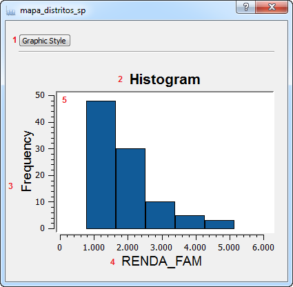
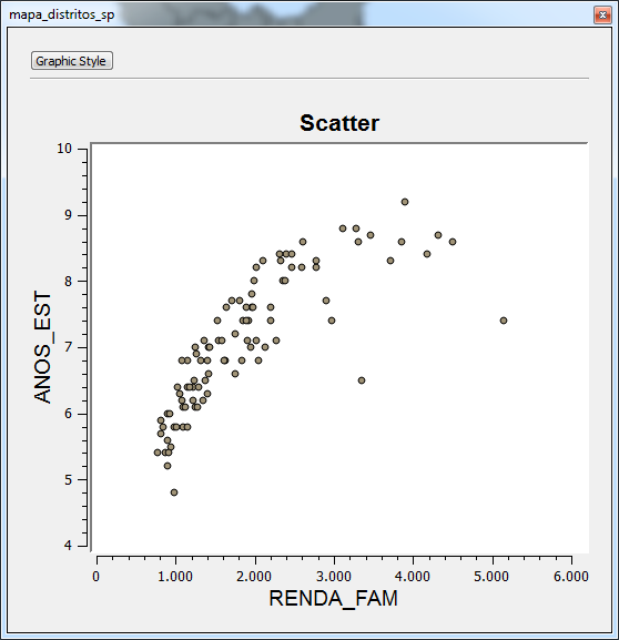
Display
The chart's display is a
window used to display the generated chart and
to allow the user to interact with it. It is possible to highlight data
of interest, zoom in & out and pan. The
basic
appearance of the screen is as follows:
Interface
description:
1 - Graphic style button - Opens up the chart style
dialog.
2 -Title - Displays the title of the histogram chart.
3 - Y Axis label - Displays the Y axis' title.
4 - X Axis label - Displays
the X axis' title.
5 - Plot area - The area where the chart will be drawn.
The following steps will
explain how to perform such operations:
Highlight:
The highlight function allows
the user to highlight data of particular
interest. The way to highlight the data will depend on the type of
chart being shown on the display.
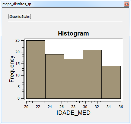
Histogram
To
highlight a histogram's interval simply click on the desired
interval and all data contained by it will highlighted on the chart and
any other windows that are displaying data related to it (such as the
table or the map
display).
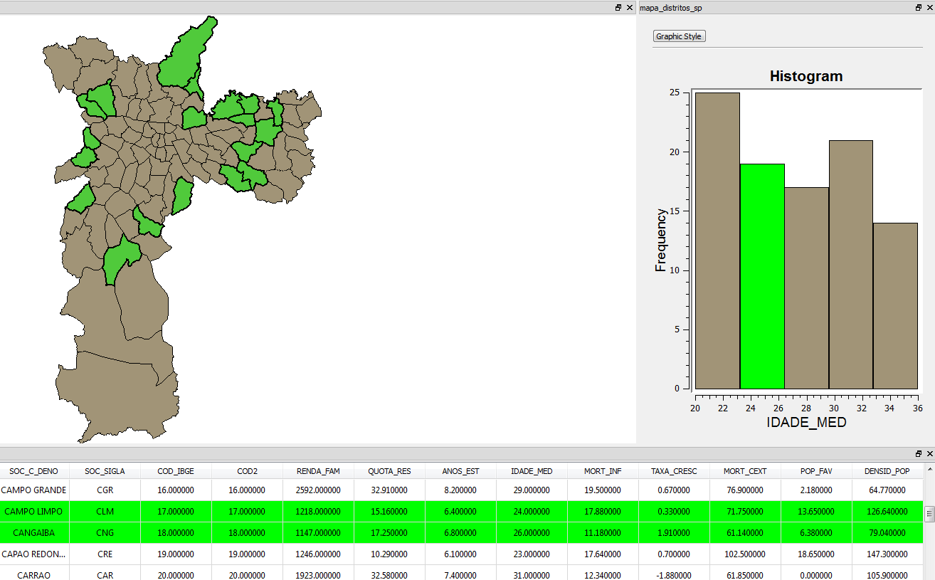
For example, clicking on the IDADE_MED interval that corresponds to
values between 24 and 26 years old will highlight the states that
correspond to that average age in both the table and the map display:
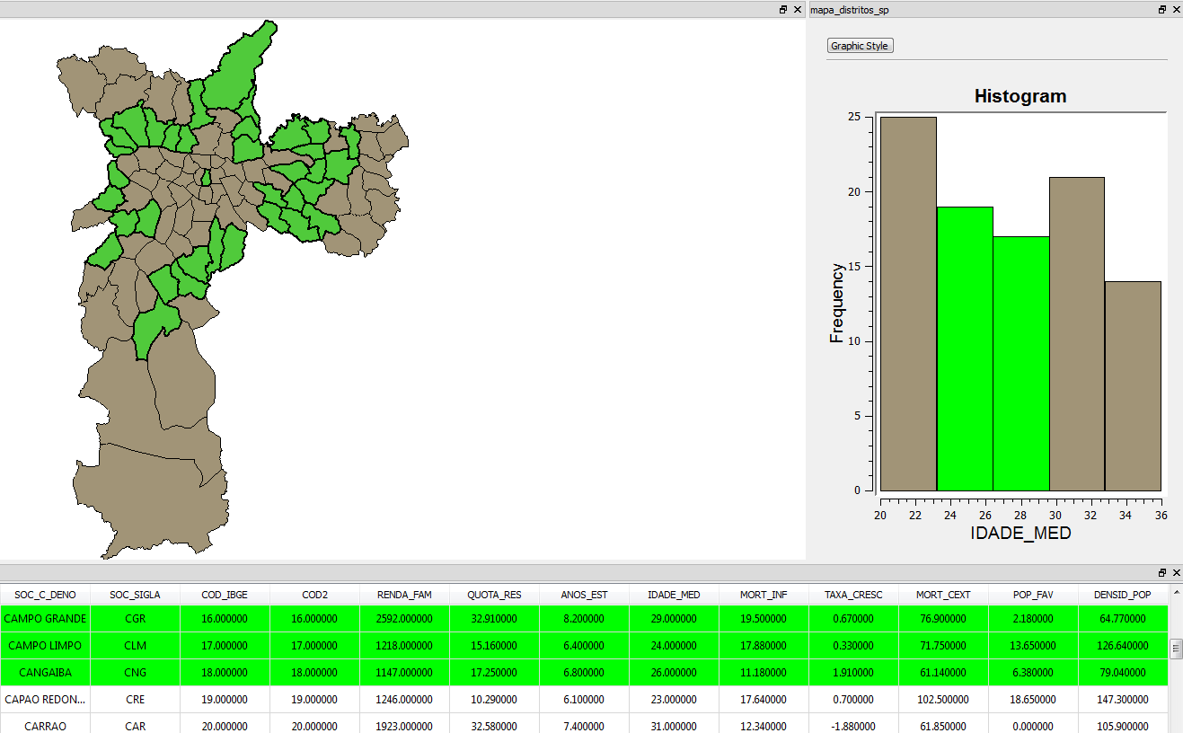
It is also possible to highlight more intervals once one has already
been highlighted, in this case, the newly selected interval will be
added to the previous selection, in order to do so, hold the control or
the shift button while clicking on the interval of choice.
For example, adding the interval that corresponds to values between 28
and 30 years old :
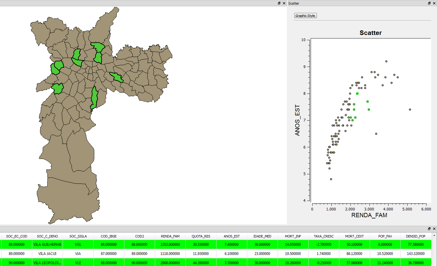
Scatter
To
highlight a scatter's interval click and drag the mouse
button
and a rectangle will be drawn, adjust it's size to contain all the
points of interest and all data contained by them will highlighted on
the chart and
any other windows that are
displaying data
related to it (such as the table or the map
display).
For example, drawing a rectangle that contains years of study between 7
and 8 and family income between two thousand and three thousand:
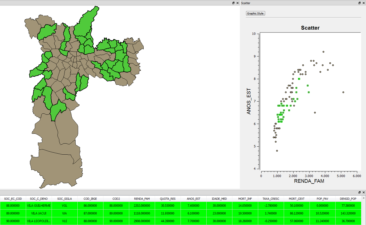
It is also possible to highlight more intervals once one has already
been highlighted, in this case, the newly selected interval will be
added to the previous selection, in order to do so, hold the control or
the shift button while drawing the selection rectangle.
For example, adding
a rectangle that contains years of study between 6 and 7 and family
income between one thousand and two thousand:
In any chart type, clicking on an empty space removes all selected
objects.
Zoom:
Zooming in on a chart can be useful when the data being displayed
contains to many intervals or points. In order to zoom in or out of a
chart simply roll the middle mouse button. Forward to zoom in,
backwards to zoom out.
Pan:
It is also possible to pan the chart Display to check the data of a
specific point. To do that, simply hold the middle button and drag the
mouse to the desired spot on the display.